Another Shoutout to Nurses
Each May, National Nurses Week is an opportunity to recognize nursing professionals and celebrate their service and dedication. How especially true through Covid.
To continue my participation in Nurses Week, I donated a painting to be given away among the nurses at a local hospital. The painting was inspired by a run I did at a nearby national park. This choice was a way to reinforce the beauty of local landscapes and a celebration of health and fitness—important to these professionals.
This year’s recipient was Amy from the Adult Echo Department shown in the photo on the right. To her and the rest of the nurses, I say thank you for all that you do!
more
Fairy Dust
These two paintings show my attempt to add an iridescent pigment to some areas. The creative intent was for a subtle shimmery effect. After I applied a layer of varnish, the iridescence was almost indistinguishable.
Nonetheless, I had fun creating pieces where color and texture stole the show and who’s to say they there’s not some magic there.
more
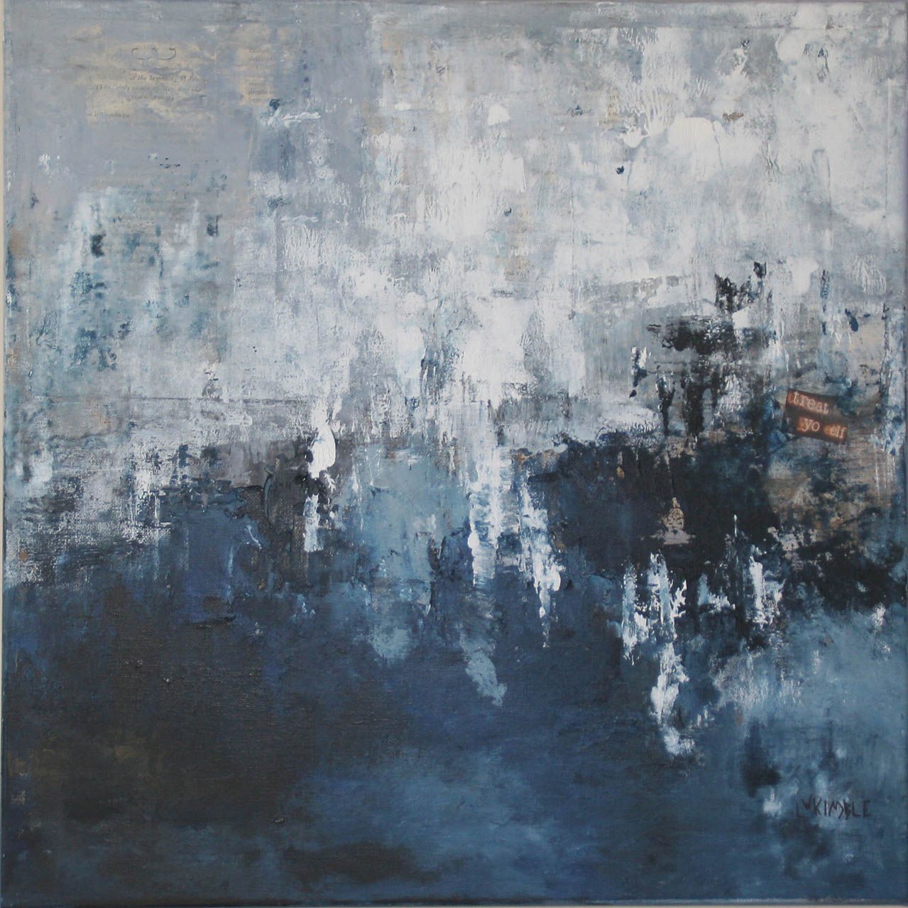
A Blue Period
Cerulean Cypress is a scene I photographed close to the Ashley River near Charleston, South Carolina. Rather than recreate my photograph, my own color scheme emerged of mostly blues and greens. It’s my way to make something new from something borrowed.
more
Yippee Ki Yay (A Stickwork)
Back in 2018, Pease Park Conservancy commissioned renowned sculptor, Patrick Dougherty, to construct a temporary artwork in Pease Park located in Austin, Texas.
The sculpture consisted of five L-shaped elements and was made from locally harvested ash and Ligustrum branches that were then bent, woven and fastened to create tall, curved leaning structures. This stickwork, to be enjoyed by children and adults alike, would last about 2 years before decomposing and concluding its natural life span.
Participating as a volunteer for a day during the three-week installation, I learned that constructing this artwork was harder than it looked. Under the direction of Patrick and his son Sam, other volunteers/artists and I worked on a particularly cold January day and found that bending these materials was equal parts art, science and brute strength. After working on one small section for an entire day, I made but a small dent in the construction.
Despite the chilly weather and sore muscles, it was a fabulous day to experience Mr. Dougherty’s vision, labor with other...
more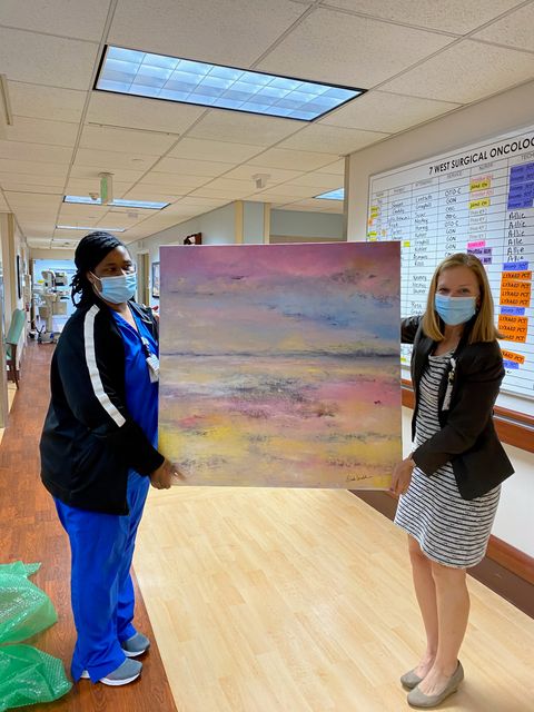
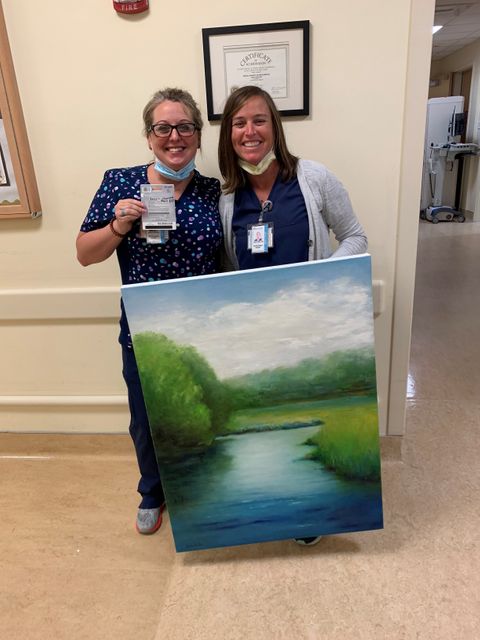
Let's Hear it for Nurses
2020: A year to challenge everyone! Certainly, we each have our own issues yet, how do we fathom what our health care professionals face? Recently, I became aware of how many nurses are experiencing “compassion fatigue” as the pandemic lingers.
The stories were disheartening and highlighted how they must battle professionally each day while coping on a personal level.
As I worked on a painting later that day, the conversation lingered with me and I decided that I wanted to make a small effort to help bring some joy to area nurses. I contacted the local hospital to see how we could create a random drawing among the nurses to receive a painting. My timing worked well to coincide with an appreciation week at the hospital.
I chose my painting, Summer Sunset, which was inspired by the colorful sunsets that can be viewed from the hospital campus near an adjacent river.
Here is a photo of the recipient, Kendra on the left, who is an oncology nurse. I hope that if she misses the sun setting while working, she now has a version waiting for her at home. A...
more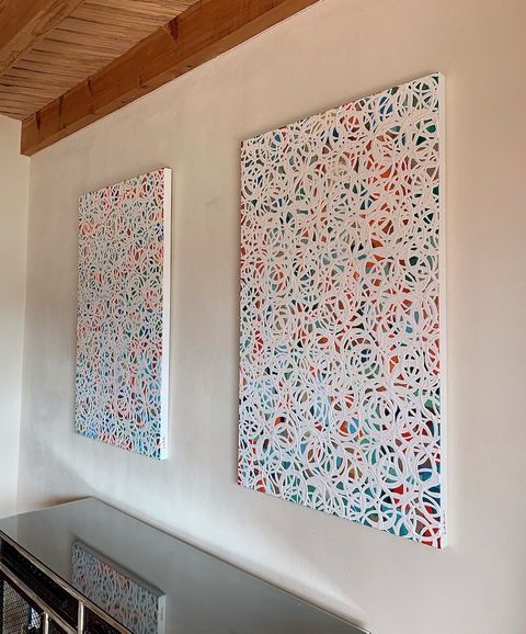
Nothing Ever Stays the Same
My goal was to paint something with an abundance of fun colors with levity and light.
I started by painting a base of many colors with no consistent pattern. Then, I fashioned circles with glossy white paint using a measuring colander. I kept adding circles until I felt I had achieved the optimum movement.
I called the results “Nothing Ever Stays the Same 1 and 2”. The title represents the flow of the pieces and the feeling that we don’t have one hundred percent control over things and that is okay.
Next, I created two more where the background is an ombre pattern from blue to green— some of my favorite colors and in response to new surroundings by the ocean. Maybe nothing ever stays the same and perhaps, with this recent move, that is a good thing.
more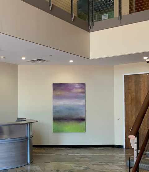
Distancing 6 Feet or 6 Inches
I have always had an affinity for the works of Mark Rothko. Like many people, I am especially fond of the large colorful works late in his career. To me, it was fascinating how he made something very large, bold, and easy to appreciate from a distance while also being captivating from a close range of perspective. Somewhere I read that when Rothko was asked, “What do you feel is the perfect distance in which to view your art”, his answer was “Six inches”. Thus, the irony of his large-format works.
Earlier this spring, when the world was changing by the hour and the pandemic was flexing its grip, I had the opportunity to provide art for an office building lobby. Time was of the essence to complete before a likely quarantine and fatefully I had several pieces in inventory which worked wonderfully with the space.
The largest of the three, called Violet Horizon, is an oil painting that has a semi-translucent, raw umber glaze which runs vertically in contrast to the horizontal composition. For this long lobby area, I felt that the composition could be appreciated...
more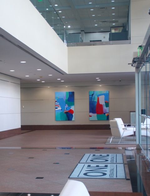
One International Centre
Continuing my work in large, public spaces, I was commissioned to create artwork for a newly renovated lobby. In matching the architecture of the property to the painting composition, I visualized vibrant colors accompanied with prominent, curvilinear shapes to complement the geometric or linear designs already in place.
For inspiration, I was reminded of the shapes I observed on a recent flight from Houston cruising at 20,000 feet on a clear day. I could see all the various tracts of land in many shapes and sizes. I felt I was looking at a multitude of abstract paintings.
In creating these paintings, I used parcel maps as my guide, taking artistic liberties along the way and paying homage to the cut outs that Matisse introduced in the 1940’s.
These paintings invite the observers to visually notice or create their own special shapes- imagining nature as a lake or river, or sensing an outline of a bird, person, or childhood memory.
Many landlords are trying to provide spaces where people say, “I like to come to the office”. Public art can bring...
more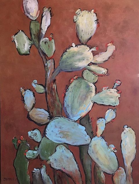
Being Bold in Design
Lately I have been working with several savvy developers and commercial real estate managers who agree that thoughtfully curated art, which stands out while blending in with a building's overall function, can attract and maintain tenants.
In one building where the owner is renovating common areas to provide a fresh and modern look, we have been adding art to each area after its renovation with the goal of making the floors distinct from one another. Have you ever been to a hotel where they have the same artwork on every level? With millions of art options available to properties such as office buildings or hotels, there is really no excuse to have the same artwork on every level. It only requires a few more steps to create a unique experience.
Back to this project- we have been working our way through the thirteen stories and placing art on each floor that is completely different from the others. In addition to the uniqueness of each floor, the owners have the option of re-hanging the paintings by switching from one floor to the next, in essence periodically...
moreAdding Personality to New Construction
A recently completed office building was beaming with shiny “newness” but lacked personality or focal points. I met with the client to review the areas that needed artwork and to propose a plan that would complement the space and help the owners differentiate their building from competitors.
One of my favorite things to do, besides the actual painting, is to create pieces that can work with, compliment and transform a space.
In this instance, the lobby was devoid of any focal points or color except for a prominent pattern found in swivel chairs in two areas. The rear lobby had colorful orange chairs to work into the composition.
For the largest seating area in the front lobby, my answer was to create prominent drip paintings with separate but coordinated colors for the area over a gray couch (one with a black background and the other green). Since the largest tenant in the building was one of the largest accounting firms in the county, I called the black painting “In the Black” and the green version was “Money Green”.
The smaller seating area needed...
more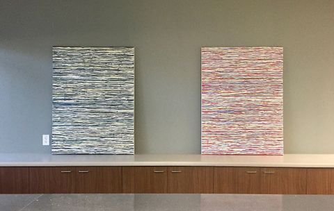
Creating “Between The Lines” and a Hidden Message
This project was for a commercial property that needed two paintings which could either work together or stand alone, separately. I planned my composition, the color scheme and started the work.
During the process, I decided that I wanted to add another element or layer within the work that would be somewhat visible but not legible. Essentially creating an “intention” within the work but having it be hidden from the viewer.
There were a few thought processes behind burying this subliminal content: One, there is no shortage of platforms on which to broadcast one’s views. Taking a contrarian approach here seemed refreshing. Two, given the public space in which these would be hung; obscuring the text would avoid any potential discord among the tenants. And three, I was inspired by the story of my neighbors who wrote messages on the walls of their home during construction which were then covered up with the finishing sheet rock (messages of intention).
The messages within my paintings were shared with the client and were also documented on the...
more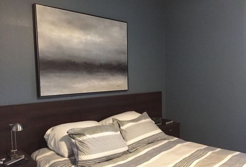
Assignment: Modern while calming
A client in Austin was in the process of updating and modernizing his condo. For his bedroom, he needed a large painting to serve as the focal point while keeping the mood calm and serene. The walls were painted a rich, dark gray/blue so I kept the color scheme to a minimum after starting with a base of burnt sienna for subtle warmth.
A photograph rarely does justice, but hopefully you agree that 'Evening Song' looks great. An observer commented that the painting was sensual and moody- perfect for this setting!
moreShowing at Hyde Park
This weekend I am wrapping up my show at Hyde Park Grill (Duval) in Austin and pleased to say it was a fun and successful event. During the weeks that my art was on display, my husband and I ate at the restaurant several times. Sitting in a large space with other patrons- surrounded by my paintings- was a rather surreal experience. It was as if I threw a party yet I didn't know anyone who came!
Now I have to get busy to prepare for my September show at Hyde Park's south location in Austin. Hopefully it will be another party for strangers - or maybe friends I have yet to meet.
more
Mission- A Commission
I wanted to share a fun commission I did for a couple who live in the King William district in San Antonio. While inspired by another one of my paintings, this client needed a larger piece in a landscape orientation. They chose a simple black metal floating frame and I think it looks great in their condo. One of my favorite things about this painting is that people see different landscapes- some see water while others see low clouds and a low mountain range. When people can define a painting in their own context, I feel like I did my job :-)
moreAll the World's a Stage- or Your Living Room
Working with another commercial client, the owner had undertaken a considerable renovation to completely change the look of their two lobbies in a downtown office building. A conscious effort was made to provide several spaces where employees could escape to or convene in throughout the day. The results were effective and impressive.
In creating a modern look with a comfortable feel, there was only one component missing - art, of course! We added two large oil paintings to one seating area and a colorful acrylic piece to another. It instantly made the areas more “homey” and relaxed when you sank into the cushy furniture…Job? What job?
more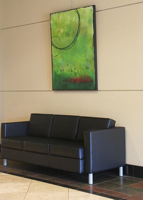
Creatively Modernizing
It's impossible to pick up a magazine these days and see anything but the virtues of modern design. It seems that to be current- as "in the moment" means to be modern" - in architecture, furniture and fashion.
If you are starting from scratch that would be an easy assignment. But many of us begin with the palette of existing architecture, like a Tuscan-inspired design, for example. Or in the case of dated commercial properties there could be brass finishes or mauve paint. No matter what you have to work with, when there is a desire to revitalize the look to compete with newer properties, the answer is usually found with clean lines and color schemes.
To that, I say “Art to the rescue!”
It is amazing what a few modern art pieces can do to breath life into a space. Recently, I worked with a couple of commercial clients in San Antonio to change up their lobbies. In addition to the new artwork, the company who occupied the building added their own photos. This combined with new contemporary furniture really transformed their space.
more
Full Circle
In June, I completed several art installations for three office buildings. The project was very exciting as each space was a blank canvas allowing me to interpret a response with the artwork. The lobby environment presented a slight challenge due to massive amounts of marble and granite which possessed its own motion/movement. My solution was to keep the subject matter simple (yet large at 62 inches by 62 inches) while incorporating texture and subtle color. Other areas needed a boost of color and I was happy to oblige.
Part of the overall creative process for this installation was the ‘full circle’ nature: several decades ago, I worked in the commercial real estate industry managing office buildings. It was great fun to be back in that environment and working with professionals whose objectives were logical to me.
In addition to nine permanent pieces, I created three paintings to temporarily display in common areas. In two of these, I used a brayer tool to apply some of the paint which created a more geometric effect.
more
Adventures with Wood
Earlier this year, I added to my Serenity series with two pieces that I painted on Birchwood. After seeing a number of Rothko works recently, I was motivated to create something colorful but simple. These were designed to be hung in a space that had very little color so this is definitely the brightest spot in the room. I liked the sharp corners that the wood ‘canvas’ provided so next up was a much smaller project using similar colors but in more pronounced application. I recommend priming these pieces very well before you paint if they are in a natural state.
Next up, I painted a couple of pieces where I started with a lot of texture. The first one was an exercise of recycling a canvas that my daughter had started and no longer wanted. It was energizing seeing how the texture played with the various colors as I layered with acrylic. I had so much fun with the first one that I created a similar piece with more subdued colors.
more